This blog is part of an extensive series on B2B lead generation and revenue growth (and salary growth - the thing that really matters to you).
The parts that come before this B2B landing page blog are:
- This blog about unique selling propositions.
- This blog about permission assets (which your landing page is all about).
- This blog about thought leadership permission assets.
- This blog about case study permission assets.
- This blog about buying guide permission assets.
For the parts that come after, scroll to the bottom of this blog.
In this blog, you’ll learn how to build a compelling B2B landing page for your permission asset (your primary lead generating asset, which you learn all about earlier in this series).
If you’re reading this and you just want the work done for you, we have a team for that. They can be yours. And you just have to get in touch with us here.
As with the other blogs you read on our website, we outline how people in different roles in your business can get the creation of your lead magnet done easily. Simple steps based on who you are.
There’s a method for owners, directors, and others managing staff at a high level. We call these people Conductors.
There’s a method for sales professionals and others who might be interested in creating a permission asset to help with their main job role. Making this kind of content isn’t their primary responsibility, so it’s done quickly, off the side of their desk. We call these people Curators.
And there’s a method for the marketing manager or marketing generalist or content writer. We call these people Creators.
Over the next few thousand words, you’ll learn how to write, design, and deploy a landing page where users are funneled to trade their contact information for your permission asset.
We’re making it as easy as possible for the person creating the permission asset to repurpose existing content into the landing page. In this blog you’ll see:
- wireframes for the design.
- an easy checklist for the 8 elements you need on the landing page.
- practical tips to make it all as low-energy and user-friendly as possible.
So without further ado…
How do prospects exchange their information for your permission asset?
Print this blog and stick it on your wall so you can follow it easily every time you need.
The most common way is via a landing page. Or a squeeze page if you prefer. Or a chazzwazzers page. One of those is not real. Did you google it? You should.
It’s a page on your website with a form (and lots more) where the user inputs their name and email to download the permission asset.
But the success of the landing page isn’t guaranteed. Most permission asset landing pages convert (that is, turn a prospect into a lead) at less than 0.5%. Because most landing pages don’t make a compelling case for the prospect to download the permission asset.
In this section, we’re going to show you how to craft a landing page to blow that 0.5% conversion rate to smithereens. One that’s full of passion, excitement, validation, benefits. Everything your prospects want and need to go from an anonymous website user to a hot lead and, eventually, a high-lifetime-value customer.
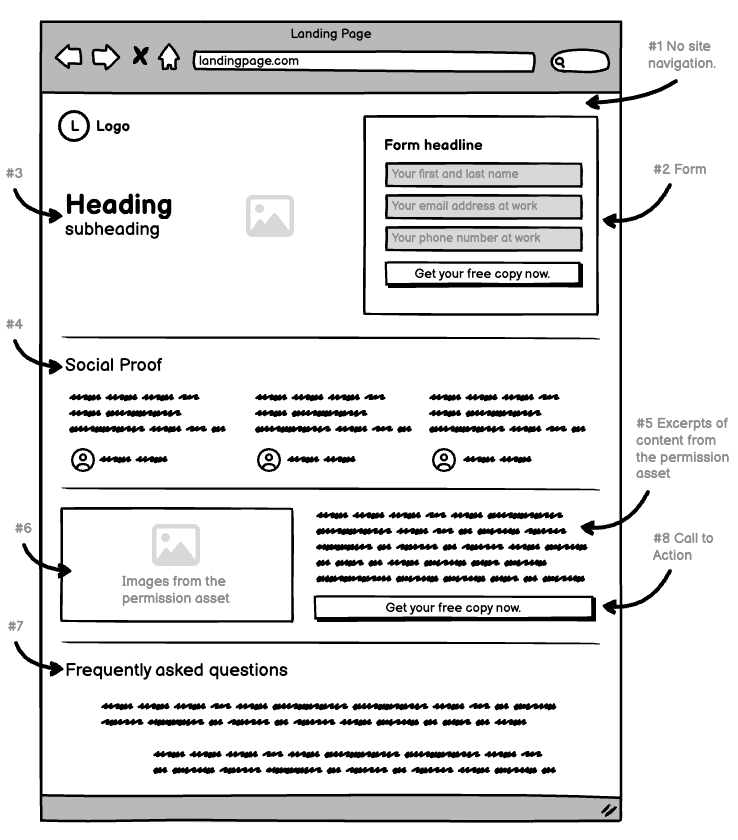
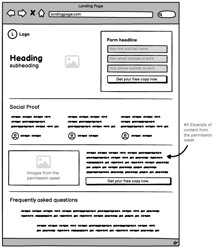
Here’s what you need (and don’t need) on your landing page:
- No site navigation.
- A form.
- A strong above the fold image and heading with supporting subheading text.
- Social proof.
- Social proof supporting the professional position of your business until you have social proof pertaining to the permission asset itself.
- Excerpts of content from the permission asset.
- Images from the permission asset.
- Frequently asked questions.
- Calls to action.
We’ll dig a little deeper into this now.
#1 - Why should you hide the website navigation on your landing page?
People get distracted. People want the path of least resistance. Everything wants the path of least resistance. Ever wonder why, out of the entire forest, the bear or deer chooses to walk along the human hiking trail (or, as it turns out, the human chooses to walk along the bear or deer trail)?
Path of least resistance!
Out of necessity on your landing page you introduce an element of friction. Resistance. The form. The prospect has to complete the form to get the permission asset. Without the form, you don’t get any information about the prospect.
In that moment, when they are on the verge of sharing their information, it’s easier to click away on the site navigation than to complete the form.
So you remove website navigation to take away the temptation. In doing so, you double the number of leads you get from your landing page vs a landing page with website navigation.
#2 - Are all forms equal, and how can I make my form awesome?
Two elements of your landing page live above the fold. One is hero messaging (which we’ll talk about below in point #3). And 1 is the form.
The form usually sits above the fold, occupying the right ⅓ to ½ of the screen.
The form is the last hurdle your prospect has to overcome before giving you their information. It’s the gatekeeper for all your leads. You need to get it right.
And you can!
So let’s run it down real quick here.
There are 4 elements to your form.
- The heading.
- The form fields.
- The placeholder text.
- The button text.
The heading on most forms is overlooked, neglected - a missed opportunity. Look at the text above the form fields on your competitors’ permission assets. Even the contact us forms on their product pages. It’s generic and does nothing to enlighten and empower a prospect.
Your heading should be benefits focused.
Learn how your business can benefit for free.
Get your free copy & cut your research time in half.
See how to improve XYZ today!
It doesn’t take much to make your form heading more appealing. And it pays off in leads.
The form fields and placeholder text for a permission asset form should be minimal.
Each field on your form is a point of friction. The more you ask, the less likely a prospect is to complete the form.
The permission asset itself already gives you a lot of information about the prospect.
- The type of product or service they’re in market for.
- Their willingness to engage in education.
- Their openness to your brand.
And a few simple fields in your form give you any other information you need:
- To target them with follow up marketing.
- For your sales team to meaningfully follow up with.
Generally, here’s what we recommend for most B2B permission asset forms.
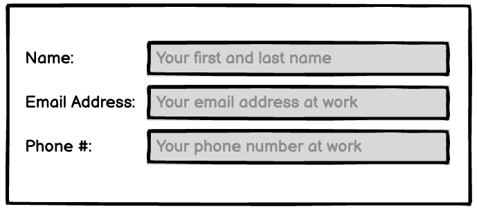
You could even make the phone # non compulsory. Or leave it out entirely. But we like it and have had success collecting phone contact information for our clients over the last 10-12 years.
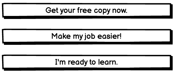
The button text should never be the default text set by your form builder.

…not very compelling text.

…downloads sound like they take a long time, big commitment. So avoid that too.
You want to keep reinforcing the value the prospect gets by downloading the permission asset.
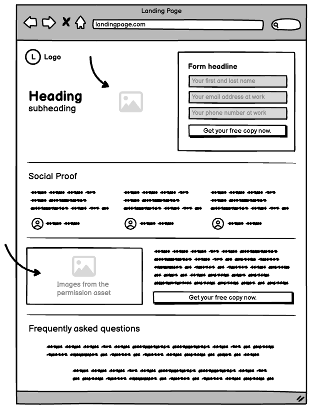
#3 - Your above-the-fold text and imagery.
The image and copy above the fold sharing this coveted space with your form are your most valuable assets on this page.
They set the prospects’ expectations. And build their excitement. And push them past the friction that comes with filling in any form online.
The image needs to match the prospect’s expectation. Don’t lead with a hero image set in a tropical rainforest if your permission asset is a thought leadership piece on product applications in the arctic.
But also don’t feel too constrained by the B2B-ness of things. You still sell to people, and people like quirky, creative things.
We once wrote a thought leadership piece for a client manufacturing biological safety cabinets. And the hero image contained a handful of BSC’s involved in a prison break. It was awesome.
But the image doesn’t have to be quirky. Sometimes it makes more sense to show your prospects something familiar. Something they can relate to. A scene they see themselves in - as long as it’s related to the subject matter in your permission asset.
Where can you find inspiration for this imagery?
You may already have some great ideas for engaging imagery in your permission asset. You could expand one of those into above the fold imagery. You could spend some time on YouTube exploring videos related to your permission asset’s subject matter. You could look at your competitors’ websites. You could look at the images Google returns when you search there.
The texts should be short but impactful. It needs to fill in the spaces the image can’t.
Not the physical spaces on the screen. The logical spaces in your prospect’s understanding.
There is space here for a heading and a subheading.
The heading is your main message, the subheading supports that message.
The heading is short. The subheading is less short.
And you can probably place your text in one of two camps.
- Something controversial.
- Something beneficial.
If your permission asset is a piece of thought leadership, you might have something controversial to say. And that’s what brought prospects here in the first place. So lay it out there.
If your permission asset is a buying guide or case study, it probably lends itself more to a statement of benefit to the prospect. What will the reader get out of this permission asset? You wrote it with purpose, so boil that purpose down to its essence.
#4 - Social proof to put prospects at ease.
Whether we admit it to ourselves or not, we’re all influenced by our peers.
Maybe it’s because we don’t want to feel like suckers alone. Maybe it’s because we all feel like imposters, but trust others to help us stay on the right path. Maybe it doesn’t matter.
When we see a peer has received some benefit from a business, we get a little more comfortable with that business. We give a little trust.
And your permission asset landing page is the place to build that trust with social proof.
Social proof = testimonials
Yes, it’s just a fancy rebranding of old-news testimonials. But they work. So use them!
How do I use social proof when my permission asset is brand new?
Great question!
You have to get creative in the start. But you’re used to that.
The social proof doesn’t have to be explicitly about your permission asset. You just have to find some positive words about your business with a tenuous connection to the content in your permission asset.
So…
- Look on Google for “YOUR BUSINESS NAME or YOUR PRODUCT NAME reviews”.
- Visit Reddit and type your business name or product names into the search bar and see what people are saying.
- Rinse and repeat with other social networks (don’t avoid TikTok, even if it’s not quite your demographic. You’ll be surprised what you learn about your customers there).
The first thing you can do is take any words you find and put them on your landing page as-is. You don’t need to attribute them to anyone. They’re in the public domain. But if you want to, you can do one of two things.
#1 - You can attribute it to the user and the social media platform in a few ways. If it’s a platform like Reddit where users have aliases (MuscleArms1982, for example), you can attribute it to the alias. We don’t do this, but there’s no reason you can’t. If it’s a platform where every user is “real”, like Facebook or LinkedIn, you can attribute it to John B. on LinkedIn.
#2 - Or you can contact the person who said the thing about your business and ask them for permission to post it with their name and business. Or you can ask them for a different testimonial altogether. Every one of these social platforms has direct messaging you can use to start that conversation.
When you start getting more permission asset downloads from this landing page, you can use the contact information you collect to solicit more specific social proof about the permission asset itself. Obviously, this is more valuable on the landing page than the general social proof in #1 and #2 above.
Email prospects two days after they download the permission asset. Ask what they thought. And if their response is favorable, ask if you could publish their thoughts on your landing page.
Example email to send to prospects you want permission asset testimonials from.
Hi firstname (*note - it’s best to use the first name. But if you don’t have the first name for some reason, insert any cordial greeting).
Hope your week is going great so far. I heard that Phonenix commute can be rough in the summer.
My name’s John and I work at XYZ company. I actually wrote the buying guide about mercury analyzers you downloaded the other day.
I’m trying to make it as valuable as possible to people like yourself. Could you help your peers get more value from it by providing a little feedback? Just two questions.
Did you get any useful insights from the guide?
Was there anything you hoped to learn but found missing from the guide?
I’ll incorporate your feedback into the guide immediately so the next person to download gets more of the good stuff they need.
I’d also love to help you with anything you need related to our mercury analyzers. If you want a product demo or validation documents for your application, I can do that.
Just let me know.
Thanks!
John
The rule of thumb is to have three pieces of social proof on your landing page. All of them together in a row.
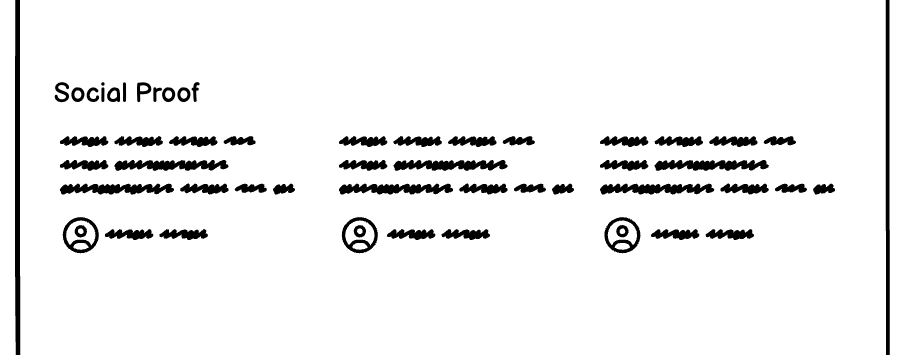
If you can get pictures of the social proofers, great! If they’re willing to share their workplace, job title, or any other information that makes them (and you) seem more trustworthy to your prospects, great!
Social proof usually lives somewhere in the middle of your landing page. Below the fold, but not at the bottom of the page. It’s too valuable to be at the bottom of the page. Most people never get past the first scroll of the mouse wheel on a page.
#5 Landing page element #5 - Excerpts of content from the permission asset to give users a taste of the value they’ll get from it
You might have kids. You were, at one point (maybe long, long ago) a kid yourself. And in the toy store, where kids dreams come true, there are toys with colorful, inviting packaging. And the most inviting part of all, the hole in the plastic or cardboard with the enlightened words “try me”.
Oh the sound of Buzz Lightyear’s sage advice. Barbie asking do you want to have a pizza party? The robotic clang of Optimus Prime transforming.
The sneak peak is not just for physical products. They’re for knowledge products as well. Your permission asset is no exception.
You can give the prospect a little sample of your permission asset on this landing page.
How do you do it?
Take your most impactful 2-3 sentences. Or your most provocative. Or your most empowering. Pair them with an image from your permission asset, and place it below the midpoint of your landing page.
Anyone who scrolls this far is searching for something to push them over the edge. They weren’t totally hooked by your hero image and form.
The social proof wasn’t what they needed.
Maybe what they need is a little taste of the value they’ll get by exchanging their contact information for your permission asset.
So place that content somewhere around here:
#6 - Images you made, or had made, or used, for the permission asset should be used on your landing page too.
Creative energy went into the images in your permission asset. They conjure the feel you want your prospects to get from the content in the PDF file you designed.
Don’t trap the output of that creative energy in chains. Let it free! Share it with the world.
Support the words on your landing page with your best permission asset images.
If they show the application - awesome.
If they’re creative and funny - awesome.
If they’re generic and boring (sometimes you only have the images you have) - it’s alright. You can always improve these over time as you find new sources (but have you looked at the places we recommend on www.jbbgi.com/resources ?)
The point is - a landing page is visual, and you already have great visuals in your permission asset. So use them!
Print this blog and keep the wireframes on your desk.
Makes your job easier and makes you look good to your boss.
#7 - Frequently asked questions can help calm prospects’ worries.
You already know the questions your prospects are going to ask. You tried to answer them all in your permission asset. You thought deeply about them when you were planning your permission asset.
Near the bottom of your landing page, as a sort of last resort for anyone who miraculously scrolled this far, speak directly about these eight questions.
What exactly will I learn?
How will this permission asset help me in my job?
How often is this permission asset updated?
Will this help me improve my standard operating procedures or application in general?
What makes company XYZ qualified to teach me about this?
How long will this take me to read?
Who wrote this?
Who is this for?
A frequently asked questions section on your landing page makes the page as a whole more complete. You address the concerns of a certain type of prospect. One that’s weary and untrusting, but interested enough to give you a chance.
They’re just looking for something personal that helps them overcome their mistrust.
Of course we don’t know if the FAQs will do this. But they could. And it’s your job to do everything you can to get more prospects downloading this permission asset.
Want to calm your own worries? Get us to generate these leads for you.
#8 - Calls to action that remind the prospect why they’re there in the first place.
Your landing page is built around a single action. Getting the user to exchange their information for the permission asset.
The prospects who scroll down past the hero section and away from the form need a quick and easy way to complete the transaction on the page.
It sounds wacky, but scrolling back to the top of the landing page manually is enough friction to stop some users from converting. So each section of the page should have a button and call to action text that anchors back to the top of the page where the prospect can complete the form.
Here are three call to action tips:
- Write short, snappy CTAs that are benefits or action focused.
- Don’t ask the prospect to download the permission asset.
- Ask the prospect to learn more, to find out how, to improve their application, to save time.
Not sure how to create an anchor link for your CTA buttons? It’s super easy.
- Highlight the text in the heading of your form.
- Right click the highlighted text.
- Click “Copy link to highlight”.
- You now have an anchor link saved on your clipboard.
- Paste the copied text into a Google doc so you don’t lose it.
What can Conductors do to get this landing page done properly?
There’s a landing page checklist near the top of this blog here.
Include that when you assign this permission asset work to your internal or external Creator.
You don’t need to know the ins and outs of why. But you need to know everything that’s supposed to get done is done.
The best person to write your landing page content is the same person writing your permission asset. And batching the work together with one person in one assignment gets it done more efficiently than any other way.
So use the checklists from this blog. Assign everything at once with tons of detail (so there are no excuses later that your Creator didn’t know X,Y, or Z). And verify (using the checklist) that everything you asked your Creator for is done to the letter.
What can Curators do to get this landing page done properly?
Landing page building tools can help you get the job done in less than an hour.
In a somewhat specific order, we recommend:
- Unbounce.
- Has been around forever, and is widely used. Not the best choice for beginners, but powerful for users with some experience (or time to learn).
- Leadpages.
- More templates than most other tools, fast load times, low initial cost.
- Hubspot.
- You might already use HubSpot for other parts of your day-to-day. It’s landing page builder is comprehensive, and easier than Unbounce for many users.
- Odoo
- Notes to add on Odoo.
- Using the text from your permission asset, the images you chose for the design of your permission asset on Canva, and your new landing page builder, you will be able to build a high converting landing page tomorrow morning.
Once your landing page is complete, you can start turning your permission asset (or lead magnet, whatever you want to call it) into a lot of other lead-generating content.
What’s next?
- Click here to learn how to turn it into a blog.
- Click here to learn how to turn it into emails.
- Click here to learn how to promote it with emails.
- Click here to learn how to turn it into social media posts.
- Click here to learn how to promote it on social media.
- Click here to learn how to turn it into a YouTube video.
- Click here to learn how to merchandize everything on your website to maximize leads.