Over the next few days as you read chunks of this blog, you’re going to learn exactly how to capture more leads using assets deployed across your website.
You can call this…
On-site merchandising for your permission asset
But first…
This blog is part of an extensive series on B2B lead generation and revenue growth (and salary growth - the thing that really matters to you).
The B2B conversion rate optimization you do through this guide is going to draw from your permission asset, or lead magnet.
We showed you step-by-step how to create the content for your permission asset in the following blogs:
- This blog about unique selling propositions.
- This blog about permission assets (where the content for your videos comes from).
- This blog about thought leadership permission assets.
- This blog about case study permission assets.
- This blog about buying guide permission assets.
If you’re reading this and you want a quick conversion rate optimization fix without creating your permission asset, consultation is your best bet. You can contact us here for that.
What we’re laying out below is part of a larger B2B lead generation strategy. The kind that transforms a business and fastforwards a career.
If you’re interested in that, you’re in the right place! You can start with any of the blogs linked above.
In this blog, you’ll learn how to get way more people to download your permission asset, or lead magnet, from your website.
That’s more people you know are in-market for your products or services. More people you can turn into lifetime customers. More ammo for your salary increase or more profits for you to take home.
As with the other blogs you read on our website, we outline how people in different roles in your business can get through this B2B conversion rate optimization. Simple steps based on who you are.
There’s a method for owners, directors, and others managing staff at a high level. We call these people Conductors.
There’s a method for sales professionals and others who might be interested in creating a permission asset to help with their main job role. Making this kind of content isn’t their primary responsibility, so it’s done quickly, off the side of their desk. We call these people Curators.
And there’s a method for the marketing manager or marketing generalist or content writer. We call these people Creators.
Find your steps below and get on the path to the revenue growth you want.
Where does your B2B conversion rate optimization start?
On-site merchandising is used when there’s something special to talk about. A promotion. A new product. A valuable piece of content like your permission asset.
The goal of your permission asset’s on-site merchandising is to direct more people from one section of the site to the permission asset landing page.
It’s about increasing awareness of something that could matter to the prospects on your website. About helping meet their needs, opening them up to your brand, and giving away value so they are more receptive to your products or services.
What kinds of things are valuable as on-site merchandising for a permission asset?
- A home page banner.
- A category page banner.
- An inline banner.
- A slide-in banner.
- An exit-intent popup.
- A chat automessage.
- A blog post (and if you already did this, great!).
- A landing page (and if you already did this, also great!).
If you’re a Creator, you can do all these things and you’re about to see how. If you’re a Conductor or Curator, we’ll show you exactly what to do starting here.
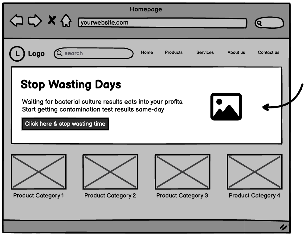
Merchandising with a homepage banner
A homepage banner is a large “hero” image with a call to action at the very top of your homepage.
Ideally it’s an attractive graphic with a compelling message and a call to action that speaks specifically to the pain or problem your permission asset addresses.
Some brands choose to place an image of the permission asset book cover on the homepage, followed by “download now”.
This idea is bunk. B2B is full of this and it’s invisible to prospects.
We will almost always choose creative imagery to get permission assets noticed. With the advent of AI image generation, everyone has the ability to generate unique and compelling imagery, even if the subject of the permission asset is very niche.
For example, one of the images below is aided by AI, one is not. Can you guess which is which?


Looking for the kind of creative direction that can get you these assets? We can help
A quickie on AI image generation as of August 2023.
AI image generators are getting better fast. Crazy fast.
Right now, the best quality images come from a generator called Midjourney.
It’s a bit complex to use. But if you’re reading this and interested, learn more about how to get started at www.jbbgi.com/midjourney.
You can also experiment with Bing Image Generator, Dall-E 2 (which comes from OpenAI - the ChatGPT people), Crayon - all for free.
The thing to know is that better prompts create better images. Learning the language of prompts is a valuable future skill and we recommend spending time with it.
The messaging in your homepage banner should be benefits oriented.
Main heading = A big benefit statement. Like “Save Your Samples Before Disaster Strikes”
Subheading = Supporting info. Like “The real value of a new ultra-low temperature freezer isn’t the energy savings. It’s the protection your samples get from future failures.”
Button = Action or pain. Like “I want to avoid lost samples” or “Learn how to shop for your next ultra-low”.
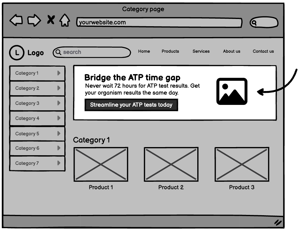
Merchandising with a category banner
A category banner is similar to the homepage banner, but it lives on a category-level page on your website.
A category-level page comes after the navigation on your homepage. It’s the bridge between your homepage and your product pages where viewer intent changes. If a visitor goes through to a category page, they’re in-market. So the messaging should be different than your homepage banner.
For example - you’re a business selling mugs. Coffee mugs and beer mugs. But you have many models of coffee mug, and many models of beer mug. So from your homepage you can click through to either “coffee mugs” or “beer mugs”. And from there, on those coffee or beer mug category pages, you run down your models.
The category pages help users intuitively navigate to products within those categories.
Alright. Now…
Your category banner sits at the top of a category-level page, and should use the same imagery as the homepage banner.
It should use different messaging than the homepage banner.
Why?
You want it to look the same because:
- Consistency is valuable. It moves you closer to those 7 touchpoints that can get your audience to act.
- A lot of thought goes into the visual representation of your permission asset, and this is one of the ways you get more return from your investment.
- You already decided on the best way to visualize the permission asset. If you need to come up with a different design for each merchandising point on the website, you’re just diminishing the quality with each one.
You want to use different messaging because:
- The messaging you used in the hero image on the homepage didn’t get the prospect to act.
- The mindset of a person on a category page is different than the person on the homepage. They’re more clearly interested in this area of your products or services, so you can speak to them differently.
- It’s easier to experiment with different words than with different imagery.
The homepage banner casts a very wide net. The category banner is a bit more focused.
For example:
Want to print the PDF of this blog and share it with your staff? Click here
Merchandising with an inline banner
An inline banner doesn't sit at the top of the page like a category or homepage banner.
The inline banner is inline with the body of the page, so it lives somewhere further down on the page.
What page? It could be…
- A category page.
- A product page.
- A blog page.
Where does it go on that page?
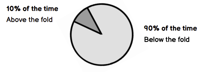
*Above the fold refers to any content that loads in the immediate viewing area when you click through to a new webpage. It’s the most valuable real estate on that page, sort of. Below the fold refers to anything that requires scrolling to reach. You could argue that below the fold content is actually more valuable because readers who scroll are more engaged and more likely to convert. But that’s an argument for another time.
And what exactly is it?
It’s a banner, which you’re familiar with.
It can follow the same appearance scheme as the other banners in the merchandising flow.
But it contains more information, because it’s further down the funnel.
So you might give a more detailed explanation of what the user can expect by clicking on and engaging with it. You can tell more of a story because of this position further down the funnel.
This is why 90% of the time it goes below the fold. Because the user is revealing their location in the funnel by scrolling to look for more information. You give them what they want.
You can use words that respond to the context of the prospect’s visit.
Because they know the very direct connection between what they're currently doing and the value this gives them.
Marketers often say clear beats clever every day. But there must be no immutable rules. In an inline banner you can be clever, playful. You can use jargon. You can make a bad industry-insider pun.
Merchandising with a slide-in banner
A slide-in banner is a small box, maybe occupying 1/10 of the screen, that slides into the bottom left or right corner of the screen when a prospect lands on a given page.
Keep that consistent visual vibe with the rest of your merchandising assets.
And whittle the message down to the most direct form you can think of. You only have a little space to fit a few compelling words. So use it wisely.
The slide-in banner can also be used comfortably site-wide because it's unobtrusive.
A user can close it if it's not for them and generally that doesn't put them off whatever part of the buying cycle they were in.
It’s like the Kit Kat bar at the checkout of the grocery store. A prospect might be on their way to completing a process or a purchase and this draws them into something else they know they need but weren't looking for in that moment. But now they’re going to investigate. And they’ll either increase their overall purchase now or return because the memory of that delicious Kit Kat (or your delicious permission asset) is fresh.
You can configure the aggressiveness of your slide-in banner in your SAAS tool (which one do we recommend? Go to www.jbbgi.com/tools).
The main one being: How long before the slide-in triggers when the page is loaded?
This is a setting measured in seconds that you get to control.
But what is the optimal amount of time to delay before the pop-up appears?
It’s different for everyone, and here’s how you figure it out based on data from your own customers in under 2 minutes.
- Navigate to Google analytics.
- Find the average customer's time on site.
- Divide that by two.
That gives you the number of seconds delay the slide-in should wait before appearing to the customer. If someone is just navigating through a page, going from the home page to a category page and to a product page quickly, they're very unlikely to see the slide-in on the page where they had no intent on sticking.
This avoids wasting the slide-in on the knee-jerk reaction of someone just frantically looking to close any pop-up because they are not interested in the current page’s content.
Adjusting this time delay setting has a huge impact on the success of the campaign, and it shouldn’t be overlooked.
Merchandising with an exit-intent pop-up.
An exit intent pop-up appears when triggered by an action.
B2Bs don’t use these very often. Because most B2Bs don’t do everything they can to generate leads. But you've probably seen lots of consumer websites with these. You move your cursor to the top corner of the screen to close the web page and up pops a few words and a form.
Hey get 10% off if you give us your email
Don't forget to download this guide so you can make a more informed purchase the next time you come back.
The browser recognizes you're going to close the website and it's a last ditch effort to get a bit of information. To get the hooks in and encourage somebody to come back.
The messaging on an exit intent pop-up can be pretty aggressive because the prospect is leaving anyway.
What do you have to lose?
I f****** hate pop-ups
- The business manager reviewing the website before it launches.
There used to be nothing that could overcome this objection.
But since we live in the future, the technology you’re using to display banners that slide in or pop up or hover over the screen all have an advanced rule set built into them. You can configure them (no coding, just click settings) to show a single pop-up, one time, to a specific user. After the user sees the pop-up one time and closes it, they'll never be bothered again.
As long as that cookie sits on their browser saying they f****** hate pop-ups don't show them again.
Over the last 5 years, we’ve rarely heard the surly manager complain about pop-ups. The ability to cookie users and hide popups based on that first interaction has breathed new life into this ancient online lead generating tactic.
Maybe dancing babies will come back one day too.

Reduce friction. Generate leads from your permission asset merchandising without pushing the permission asset download.
Your slide-in or pop-up doesn’t always have to guide the user to your landing page.
The merchandising can be a conversion point itself.
If you’re crafty, or have access to a web developer with the most basic of abilities, you can embed a form using custom HTML or a form builder. You can collect the user's contact information right there on the pop-up or slide-in with your campaign imagery above the form.
It looks like this:
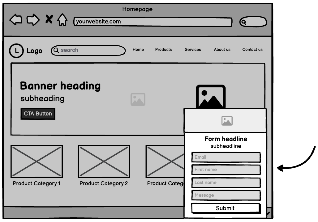
You can also integrate the lead collection data from your pop-up or slide-in SAAS with any modern CRM. So the information collected in the form is immediately put into a sales workflow or a targeted drip email automation or a text message followup automation.
When you reduce the number of steps needed for a user to declare their interest and intentions to you,you improve their user experience.
Reduce friction - increase sales.
Merchandising with a chat automessage.
Live chat is another fantastic tool that can get you permission asset-driven leads.
If you do it right.
The next time you look at your competitors’ websites, make a note of their live chat.
- Is it dormant? (meaning it's just a little icon bubble in the bottom right hand corner of the site)
- Does it greet you? (and make you feel even the slightest bit drawn to writing something in there?)
- What else do you notice about it?
For most B2Bs, on-site chat scores lots of customer service related inquiries from existing customers. It’s a reactive tool. A prospect is only going to use it if they’re looking for a super easy way to contact the company.
It's not going to persuade anyone to start a conversation with the business unless it's proactive. And when you start looking at these on-site chats through the lens of reactive vs proactive, you notice very few companies use these tools to their best.
Most companies check a box by putting live chat on their websites. They don’t optimize!
Oh boy. Are you ever going to optimize yours!
If you want it done for you, contact us here
Every chat application from Olark to Intercom to Drift (even free ones like Tawk To) have a feature to enable proactive messaging.
What this means is when a user lands on a specific page, the chat automatically opens with a greeting you can customize.
Think of what’s going on at your tradeshow booths.
What’s the number one rule sales staff or customer support staff should follow when they attend a trade show?
Budget has been poured into this tradeshow. Exhibitor space, hosting prospects and partners, travel, accommodation. The promotion that goes into driving traffic to the booth.
It’s a lot.
And the number one rule is greet people when they walk by.
Which is a problem, because it’s not enough. And it’s a bad rule. A simple hello gets you a head nod, or a hello back. It doesn’t engage anybody.
If tradeshow staff open with an engaging question, like Hi there. What type of tests do you run in your lab? They’re more likely to receive a more thoughtful answer. The person walking by has to stop, because there’s more to think about than just Hey.
If tradeshow staff sit on their thumbs, waiting for someone else to open up the dialogue, the big tradeshow investment gives a poor ROI.
By having a reactive chat on your website, you’re making the exact same mistake as above.
But I’m not at a tradeshow. What interesting proactive message do I have for prospects on the website?
What you have is a permission asset you poured a ton of resources into. And you want to give it to as many people as you can.
Proactive message:
- Hi. Hope you’re having a great day. If you want help with your purchase but don’t want to chat right now, this free XYZ buying guide will make your job easy. Just follow this link. And if you want to chat at any point, I’m Kora and I’ll be here.
- Hi. Not sure how XYZ can help in your application? Here’s a free case study that shows how other businesses have done it.
When a prospect lands on any product or service page related to your permission asset, they're greeted with a friendly pop-up offering free value.
Compare that to the messages you see in the chat on most of your competitors’ sites, which only pop up after you click the chat icon (unlike yours, which is configured to pop up proactively):
- Hi. Our customer support agent is online to help you today.
- Hi. Let us know if you need a hand.
With the proactive message approach, you generate leads from your permission asset in two ways.
- You get downloads that can be followed up on.
- You get more chats than most B2Bs.
And the chats generated by this approach are unlike any chats captured before.
Now it's a lead generation tool. A sales tool. Not just a customer service tool.
There was a time when we used reactive messaging in the chat applications on client websites. It was a long time ago. We’ve grown up since then. But there was a time. And what kinds of improvements did switching from reactive to proactive make?
The dramatic kinds.
B2B websites with a large volume of traffic (say 20k per month) that traditionally only got two to three inbound chats per day saw the number of inbound chats increase by an average factor of 9. Some increased by 20X and 30X.
Live chat vs chatbots
If you’re not using live chat on your website because the business doesn’t have the humans to manage it, you should ride the AI wave.
Live chat is great. But it consumes resources. And AI is quickly replacing the need for a live agent in most situations.
Your business can program boilerplate content into the end of Journey AI’s intelligent responses. These boilerplate blocks of text are originally intended for legal disclosures in sensitive industries, but can be repurposed for lead generation.
For your customers, Journey AI just recommended the right product. Then it closed with a boilerplate message “to validate this selection, check out this guide. You’ll learn exactly why this was chosen for you.”
Of course we recommend Journey AI over any alternative. We built it exactly for you because there wasn’t a suitable option available.
But at this point in your merchandising, a problem exists.
It can be overwhelming and off putting when competing interactive elements on your website keep popping-up and getting all up in your customers’ faces at the same time.
We don’t have a rule for you to follow about the number of pop-up elements you can or cannot have running at a time. This is all for your judgment.
Test. Go through your website like a first time user. Like a real first time user.
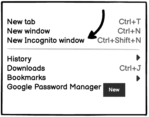
Do you use Chrome or Safari on the regular? Then open up Firefox or Internet Explorer. Open up an incognito tab. Start going through your website like you’ve never been there before.
Each time you exit from a pop-up, close that window and open a new incognito window to continue your tests so you see the full extent of your merchandising campaigns.
You might notice the chat pop-up on your site conflicts with your merchandising pop-ups, for example, and you'll need to adjust one or the other to avoid coming across like a 1996 Atlantic City casino.
Don’t forget to do this on your phone too!
Follow the same steps as above. Clear your browsing data.
But I don’t want to do that. The cookies on my phone make life convenient!
You got that right.
So download a secondary browser to your phone and have at it.
The user experience on your phone could be very different from your laptop or desktop. Pop-ups and slide-ins don’t always work well on mobile devices. Luckily, you continue living in the future and this is a super easy fix. Every tool you could be using for this (including the one we recommend at www.jbbgi.com/tools) has a setting to avoid showing pop-ups on mobile.
It’s actually a standard practice in our workflow to disable these pop-ups on mobile devices. But if yours looks slick, it’s up to you.
Want to download this blog to print and stick on your wall or in your budget presentation? Click here
Merchandising with a blog post.
Hold on. You already made your permission asset into a blog post, right? Using one of the methods we talked about in this previous blog?
But here’s a little detail you may have missed. And it will help you engage with your internal resources, like web developers, whether you’re a Creator, Curator, or Conductor.
Maybe one your imposter syndrome challenges is dealing with website resources. You’re no expert. But you have to know some basics so you can communicate with the people who do have the expertise.
Ask the person who maintains your website this:
- Is there a configuration option we can enable with a couple clicks to get blog entries on related product or product category pages?
- *make sure this is a no-coding option. Just clicking settings. Custom coding breaks things. Your developers will always say yes, they can custom code it. But don’t pursue that option. Please don’t pursue that option.
Most current website builders have these configuration options.
If for some wacky reason you want to do this yourself (Creators, we’re looking at you), the main, general steps to follow are:
- Write your blog.
- Tag your blog (if it’s about veterinary ultrasonic cleaners, tag it something like “veterinary ultrasonic cleaners.” Creativity.).
- Post your blog.
- Make sure the blog module on your category or product pages is configured to display based on tags.
- And make sure your product or category pages are also configured to display blogs based on the tag you just created.
Why do I need this blog to show up on these pages?
Because you’re adding variety to your lead generation strategy. You’re creating more opportunities for revenue growth.
On your homepage you might have a “latest news” section with the most recent blogs published for everyone to see. But eventually your permission asset blog will get pushed out of that section of the website. It’ll disappear to most people.
By putting it on related product and category pages, you’re keeping a valuable piece of content visible to the audience that cares about it most.
Maybe they weren’t interested in downloading it based on your inline banner. But they’re into blogs. They’re more likely to click through to read more if it’s in blog format. Maybe their affinity for blogs makes them more likely to download the full text of the permission asset from the links embedded in the blog you posted.
And now you have their information.
Here’s another thing. The leads you get in the first quarter after you launch your permission asset amount to about 10-15% of the total leads your permission asset will generate over its lifetime - if you merchandise it with these evergreen tactics. The magic is in the implementation, not just the creation.
Merchandising with a landing page
You already built the best landing page ever based on the rundown back on this previous blog.
Most of your other merchandising sends prospects to this marvel you created.
There’s nothing else to do but sit back and watch the leads flood your inbox.
Unless you want more landing pages made and you don’t have the time yourself.
How can Conductors spearhead the right kind of merchandising?
You’ve probably heard this before. It might be something you struggle with. But as a Conductor, you’re most powerful when you work on the business, not in the business.
That means building a standard operating procedure (SOP) for merchandising your permission asset so your Creator (and others in the business) can follow and take the burden off your shoulders.
You don’t want to find out 12 months after your first permission asset goes live that it’s generated precisely 0 leads because nobody knows about it. Because all your team did was make it and drop it on a landing page before sending a single email about it. But this is honestly where most employees stop, wipe their brow, cheer about a mission accomplished, and move on to the next thing.
What a waste of something that could generate leads for a decade if implemented correctly!
So with an SOP in place for merchandising, you can make sure everything gets done properly and your valuable permission asset is working day and night to generate your leads.
You don’t have to do anything other than read and understand the one we’ve built for you. Then tell your team it’s how things will get done from now on.
You can to www.jbbgi.com/resources to download and print a checklist to give the creator on your team, plus download and print the instructions from the creator section of the merchandising chapter so there’s no confusion about what they need to do.
As a quick reference, at this point your Creator needs to make:
- Home page banner.
- Category page banner.
- Inline banner.
- Slide-in banner.
- Exit-intent popup.
- Chat message.
They also should have made a blog post and landing page earlier in this process.
You already gave sufficient direction earlier in the process to align the permission asset’s positioning with your personal experience. And that direction should carry through the merchandising for the permission asset as well. No need for you to give further direction on this to your Creator.
Now, any time you launch a new permission asset, there’s no discussion about what needs to be done to make sure it generates loads of leads. And there’s no confusion over expectations surrounding a permission asset project.
Plus, one of the best parts of making this SOP the go-to for your permission asset merchandising is:
Measuring and managing the output of your creator employees becomes easy.
You don’t have to trust what they say about the completeness of the task. The checklist is either done or it’s not. And the assets either line up with your early instructions about positioning or they don’t. It cuts your time and energy investment by 90%.
Tips to make sure this is done right.
When you’re verifying whether your new SOP was followed, we recommend:
- Using an incognito web browser to view the website (and the merchandised content) like a prospect.
- Using your phone to view the website (and the merchandised content) like a prospect.
Tests to make sure this is done right.
When you’re verifying whether your new SOP was followed, you should test 3 things:
- Complete the form on the landing page. Does the lead actually show up in the appointed inbox? (either a general sales inbox or the inbox of a staff member responsible for managing leads).
- Download the PDF. Is it the correct permission asset? Does the download actually work?
- Engage with the chat automessage (or AI, or live chat). Does appropriate messaging show up on appropriate pages? And do you get the expected response from your bot, AI, or staff?
- Pretend you’re going to close your incognito window. Does the exit intent popup appear on the appropriate pages?
When it’s implemented correctly, you’ll see leads start rolling in. But more importantly, the leads will continue, and even grow, over the next decade. Tracking alongside your growing revenue.
Want help training your staff to follow this SOP? Contact us here
And how can Curators merchandise permission assets?
Curators like you might not have the time to implement the creation of a full suite of merchandising assets.
If you have to implement everything in sporadic blocks of time outside your main duties, you have to prioritize what will give the most value with the lowest time and energy commitment.
We recommend prioritizing like this.
- Making sure your permission asset blog automatically updates in the blog template on your product and category level pages.
- Activating the homepage banner.
- Activating the category banner.
- Updating your chat automessage.
- Activating the slide-in.
- Activating the exit-intent popup.
- Placing the inline banners in content across the website
Your main objective is to get the maximum amount of merchandising up on your website with the minimal amount of effort.
So, you need to:
- Design your merchandising assets.
- Deploy your merchandising assets.
- …as quickly and easily as possible.
There is a single tool you can use to activate your handle slide-in, inline banner, and exit-intent popup. It’s called OptinMonster.
There is a separate tool to design your banners and other graphic assets. It’s called Canva.
The tool to use for live chat, and to update your automessage in, is Olark. Unless you’re upgrading to AI chat. Then your best choice is Journey AI - since we built it to fill a gap that existed in the B2B market.
So now that you know the tools. Let’s address each of the 7 pieces, in order of priority and ease.
1. Making sure your permission asset blog automatically updates in the blog template on your product and category level pages.
This is easy and quick.
Ask the person who maintains your website this:
- Is there a configuration option we can enable with a couple clicks to get blog entries on related product or product category pages?
- *make sure this is a no-coding option. Just clicking settings. Custom coding breaks things. Your developers will always say yes, they can custom code it. But don’t pursue that option. Please don’t pursue that option.
Most current website builders have these configuration options.
If for some reason you want to try this yourself (maybe to get more familiar with the inner workings of the technology supporting your workplace), the main, general steps to follow are:
- Write your blog (you already did).
- Tag your blog (if it’s about veterinary ultrasonic cleaners, tag it something like “veterinary ultrasonic cleaners.” Creativity.).
- Post your blog (you already did).
- Make sure the blog module on your category or product pages is configured to display based on tags.
- And make sure your product or category pages are also configured to display blogs based on the tag you just created.
2. Activating your homepage banner
You have to do three things to get the homepage banner on your website.
Create the image. Add the text. Put it on the website.
If you have access to a graphic designer on your team, they will create it and add text. You just have to tell them the type of image you want. For some details about that, you can flip back to page XX.
If you have to create it yourself, here are the steps.
Step 1. Choose any of the images you used in your permission asset.
Step 2. Prepare a blank document in Canva
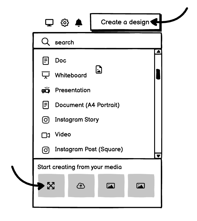
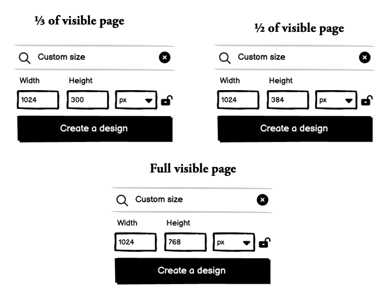
Step 3. Choose your banner image size. One of these:
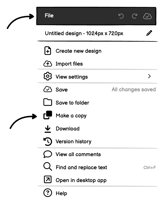
Step 4. Click Create new design
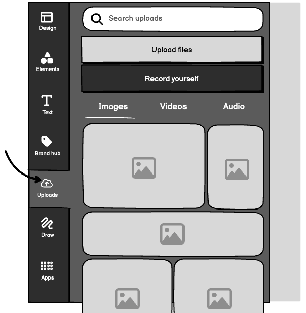
Step 5. Since you already used Canva to create your permission asset design, all your images are already available in the Uploads tab. So you can choose your image and drag it into your pre-sized homepage banner box. If you haven’t, you can just click Upload files and choose an image from your computer.
Step 6. Click the Text tab and experiment with the font you want to use in writing your banner message. There’s a section back on page XX about the messaging for your banner.
Step 7. Download it (that’s under the Share button on the top right of your screen) and upload it to your website.
Step 8. Place it on the homepage of your website. We can’t say exactly how to do this, since there are so many services you might be using. But, in general, you can simply drag and drop it into the hero section of your website in the front end designer.
Step 9. Link the image to your landing page (note that you don’t have to link JUST the button. In many cases, the button you created on your banner image is just part of the image, and clicking anywhere on the image will lead the prospect to the permission asset landing page. The button design, as it were, is just some psychology to use on your prospects).
And now you’re done with that.
You could have been done with it sooner, if you asked us to do it
3. Activating the category banner
For the theory behind your category banner, you can go back to page xx.
If you just want to get it done (which you do), here’s the Usain Bolt version.
Step 1. Duplicate your homepage banner image.
Step 2. Type new text into your existing text boxes, taking into consideration the more obvious intent of anyone who will see this banner (they’ve already clicked into the product category on your website, so they’re in-market).
Step 3. Follow all the steps to download the image you just made and upload it to your website.
Step 4. Place it at the top of the category page to which it belongs.
Step 5. Make sure it links to the permission asset landing page.
4. Updating your chat automessage
You might have already read about updating your chat automessage if you’re thumbing through sections for your Creator colleagues.
There’s a great rundown of how you can update your automessage back here.
Here’s your checklist to make sure you do it right:
- Have you enabled proactive messaging (this is whatever setting your chat app has to open the chat automatically when a user lands on the page)?
- Have you updated messages on product and category pages related to your permission asset using the examples at the link above?
Then your job here is done.
5. Activating the slide-in.
Your slide-in banner is powered by OptinMonster (OIM) or your website's native popup app.
If nobody on your team has set it up, you can go to the OptinMonster website to get started. Any guide we could give you here would be a copy of the already excellent user tutorials available from OIM.
Here’s the link - https://optinmonster.com/docs/
To design your image for the slide-in, follow the steps you used to make the homepage banner, but change the dimensions to 350 x 350 pixels.
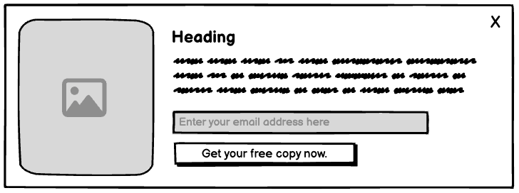
6. Activating the exit-intent popup.
Your exit-intent popup is also powered by OptinMonster or your website builder's native popup app.
So you can create it the same way you created your slide-in. Add your campaign imagery, some text, a form field, and a call to action.
Here’s a wireframe to give you an idea about how it can be designed.
And here are the 4 steps to setup the rules so it displays at the right time, when a user is on their way to close the browser.
- Find the Display Rules view in the campaign builder.
- Choose When (Triggers) from the menu on the left-hand side and pick the Exit-Intent option.
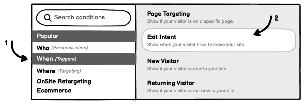
- You can then choose which devices your popup should display on and the sensitivity you would like to use (choose medium sensitivity, and display on desktop devices).

- You can also choose the pages where your slide-in appears. For your first permission asset, it should appear everywhere. But as you create more permission assets, you should make sure the slide-in is restricted to pages where users would expect it. If you sell lab baths and rotary evaporators, and your permission asset is about rotary evaporators, don’t leave it to display on lab bath pages after you create your lab bath permission asset.
And your exit-intent popup is ready to go live when you hit save.
You just have to click to the Publish menu to publish it.
7. Placing the inline banners in content across the website.
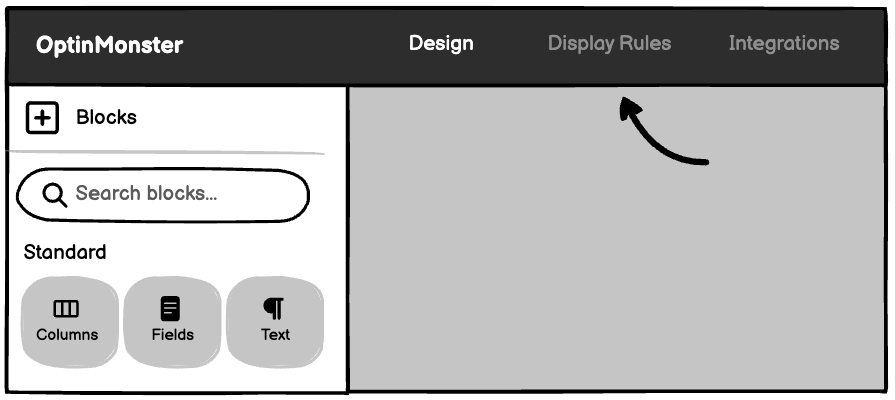
You’re familiar with OptinMonster or your website's popup manager at this point. So you know you can simply choose Inline when you create a new campaign, and that will create your inline permission asset merchandising banner.
But there’s one important difference between your other OptinMonster banners and your inline banner.
All your other campaigns are setup using display rules. The display rules dictate where they will show up on your website.
Inline banners have to be placed manually, by copy+pasting code into your website back end.
The code is generated by OIM under the Publish menu when you get to that stage, under a big yellow block of warning text, so you can’t miss it.
But if you aren’t comfortable working with code in any way, it’s better to stay away from this step, or get a helping hand from someone with a little experience.
If you are, then you just have to paste the code into the space on the page where you want the inline banner to appear.
And with that, you’ve completed all the merchandising your permission asset needs.
What comes after your merchandising is complete?
You probably haven’t prepared any paid ads to drive traffic to your permission asset landing page.
Now is a great time to do that.
We have three step-by-step guides available for the platforms you’re going to run your ads on.